Impact - a crypto platform: UI/UX & Branding case study
Now User Flowchart
After gathering a lot of information in 72 hours. I had a vision in my head of how the app will function. So, I started with mapping. It helped me understand, how an user will travel through the app. First, I started with sketches on my notebook and then I finalize the Flowchart with Flowmapp.
Web Application Flowchart
Mobile Application Flowchart
Sketches
Sketch was my imagination before I actually started the designed.
Wireframes
Inspiration Board
Check out my inspirational bucket collection from here.
Color Palette
I choose dark blue color for the project. The color blue symbolize trust, loyalty, wisdom, confidence, intelligence, faith, truth. So, I couldn’t resist myself using this color as a primary color. Additionally, I used black, grey for secondary color.
Typography
I used Niramit font family and it designed by Cadson Demak. I fall for Its simplicity and modern look. I think it’s a gorgeous font family. Niramit was a complete package for me.
Icons Pack
Icons are an important part of a project. It gives the premium and professional vibe. They communicate with users and help them understand the words easily. So, I made custom icon pack for this project. And also I used font-awesome. They have a great collection of a premium looking icons, which are absolutely free of cost
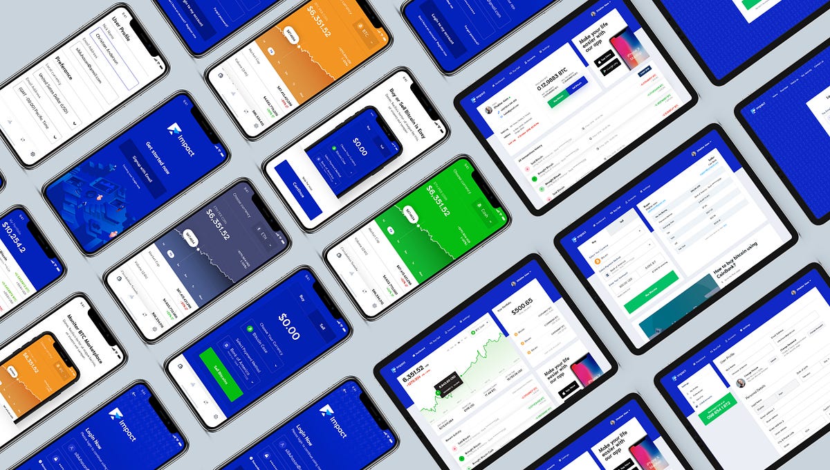
Web Application Designs
After hard and sole work. I achieve this design. Check the design from down below.
— Sign up process screens
I made the signup process very simple but added an extra feature. Which OTP (Mobile Verification) Verification. It’s allow user to add an extra layer of security. And after completing the signup, Impact will help use to understand the user interface and the experience.
— Dashboard screen
Man why it’s so simple? I know it’s simple and it’s not that attractive UI. As we talked previously we have three different personality. Not all the senior or middle age people used to fancy UI. They are old and they understand simple, old school things. So, I stick with the simple UI here. In this page, users can find the Market Data, His/her portfolio and recent activities.
— Buy & Sell Screens
It’s really simple! Users can buy and sell their BTC/Cash/ETH easily from here. By selecting the Buy or Sell tab, they can sell and buy BTC. Oh, forgot to talk about he Invoice preview. I added an invoice feature here. It always update automatically (without refreshing the page )after the inputs given by users.
— Adding Debit Card is Easy
I added a big layer of security here. Because, some users can use stolen cards. So, I didn’t forgot about them. Impact can verify a debit card by uploading a Govt ID/Driving licence/passport. After the verification, user can use their cards. The verification process will be handled by some third party company like HooYo/Trulioo etc.
— But Adding Bank is Easer
It’s easy! All you need is to collect your secure Bank details. And add theme to your account. Bamm! you are done.
— User Profile Screen
Account page is simple with the user information. Some security information and his all the transaction history. The most important thing here is the login details and all previous transaction history.
Check out the invision prototype
Original Source